Founded in 2009, Sociomantic rapidly grew to become a leader in the advertising and personalization industry. By 2015, they already had 16 offices worldwide and generated over a 100 million in revenue. They were very well positioned with top European brands selling them creative advertising services as well as a B2B platform to run programmatic display advertising campaigns.
I joined Sociomantic precisely during this hypergrowth phase in 2015. Being such a young company, they kept a start-up mentality, which allowed me to learn many different things and be exposed to large projects.
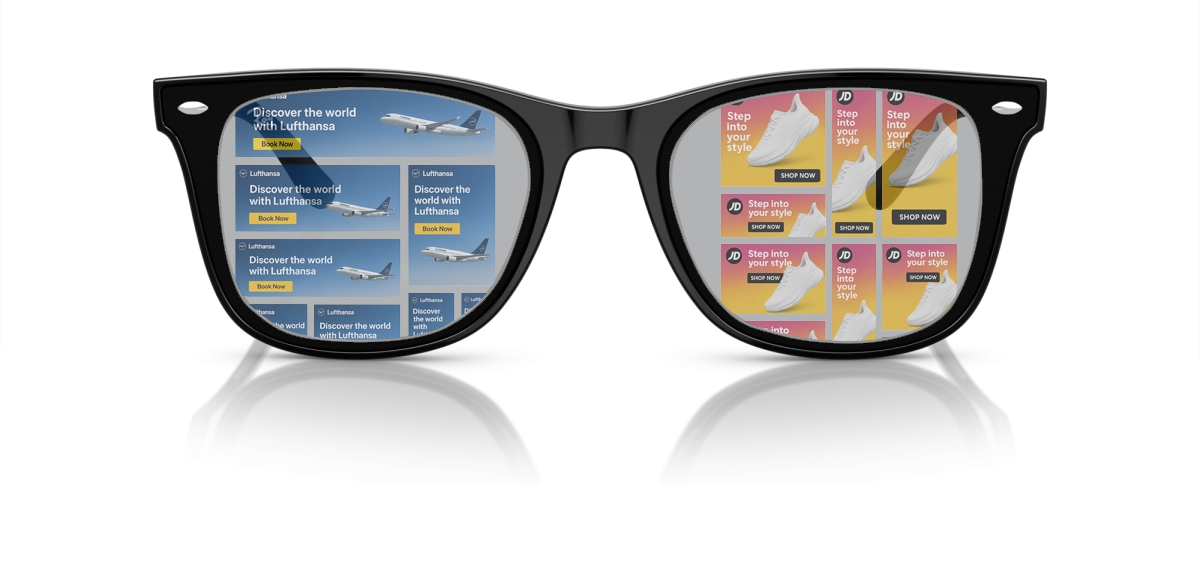
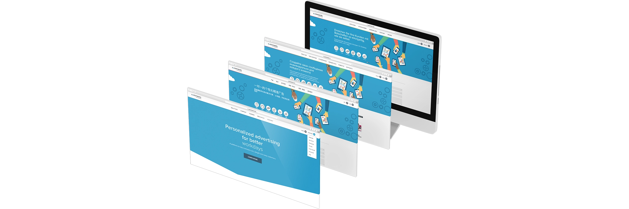
All I could see for a bit were banners
Sociomantic was the first company where I worked with a really successful and large B2B product, before I had experience in the Design industry, but mainly working for agencies.
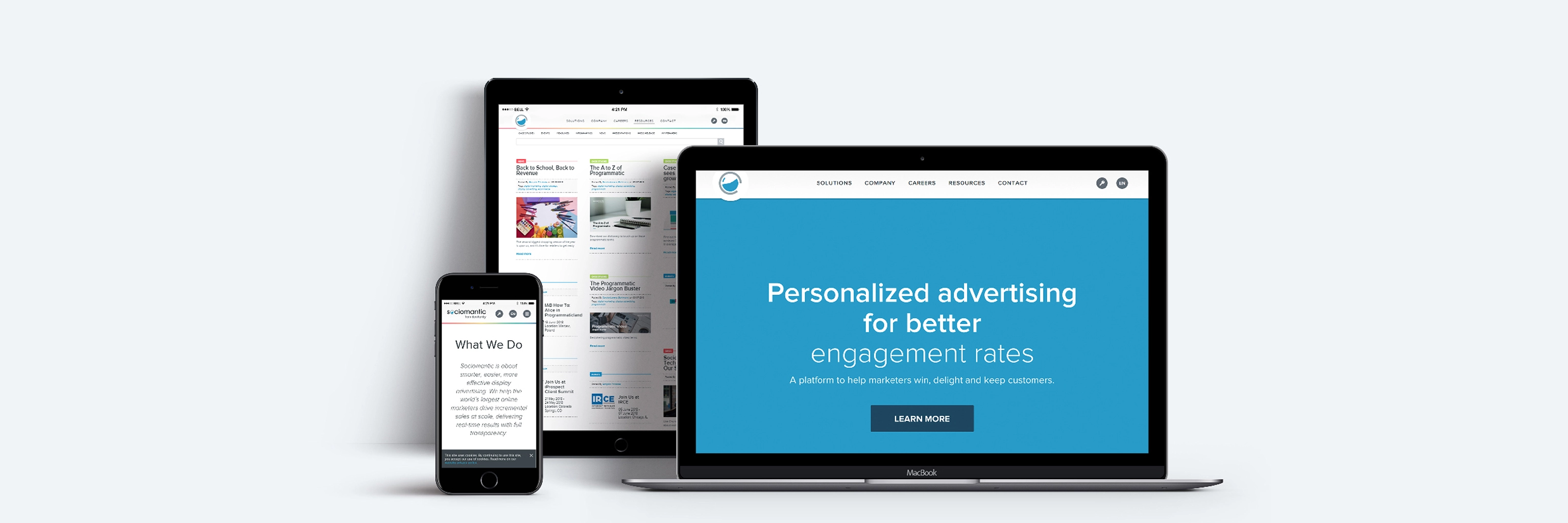
The sociomantic model was simple and effective.
Creative agency + Demand-Side Platform (DSP):
1.You define and create the campaign assets with our creative team.
2.You launch the campaign through our platform.
My first year, I was on the creative team. Another way to say I did a lot of banners… and then transitioned into a more technical role as a Web Developer, taking care of the company’s design system.
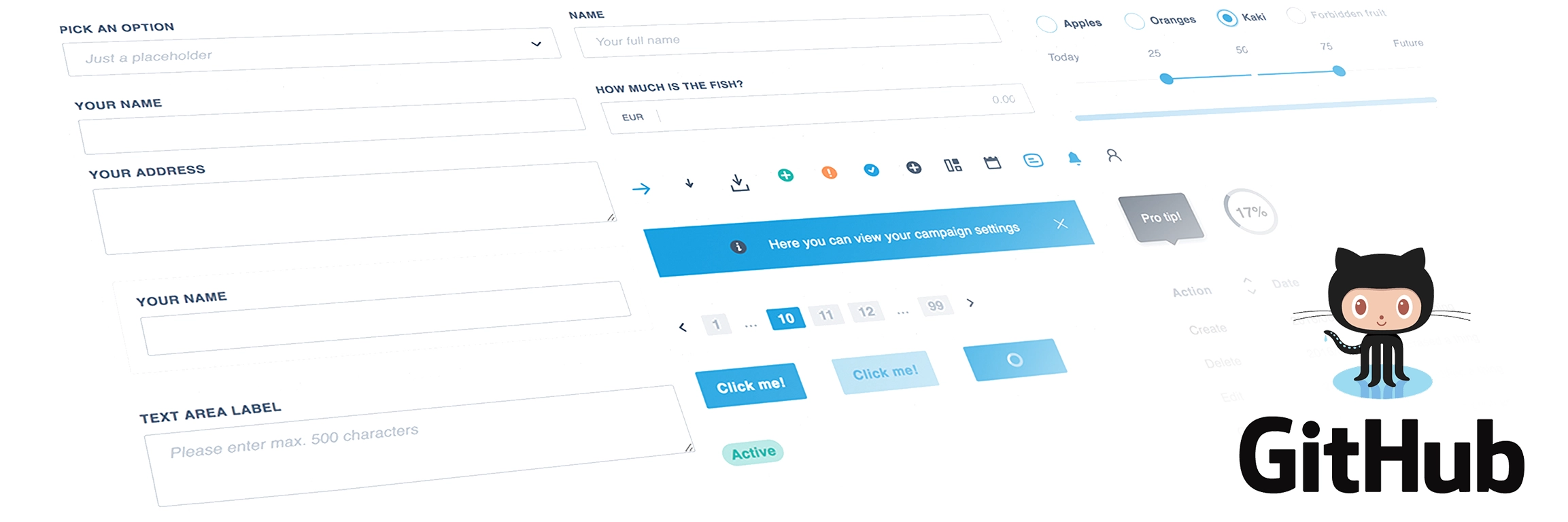
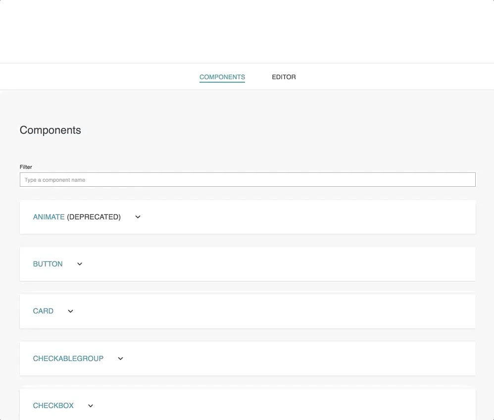
My contribution developing Sociomantics design system
Because of my previous experience developing websites and having a good grasp on UX design principles, I started to work in the Web Styling team that took care of the Sociomanic design system called Nessie.
I developed many of the components of the system itself and worked closely with the UX team, scaling the system. We developed a system that was the building cornerstone of our B2B platform, the so-called “Glass box”. Later in 2018 we made it open source for everyone.
Together with Nessie, we launched Lochness, a visualization user interface for React.js design systems, very similar to what Storybook came to be later, but developed in-house. It had a lot of very useful features, including visualization of components and a drag-and-drop builder.
• Component Library Base & Usage
• Design System / Theming & Style Support
• Icon / SVG Sprite Map Support
• Page Layout & Structural Components
• Form & Interactive Components
• Accessibility & Focus Management
• Test Coverage & Quality Assurance
• Documentation & Demo Site / Example Playground
This was the first larger project I contributed to in my career. It gave me a deep understanding of design systems that I applied across my whole career. It was really a privilege to be part of creating the Sociomantic DSP platform, which drove the revenue of the company and helped it to succeed across 70 markets.
Milestones and impact
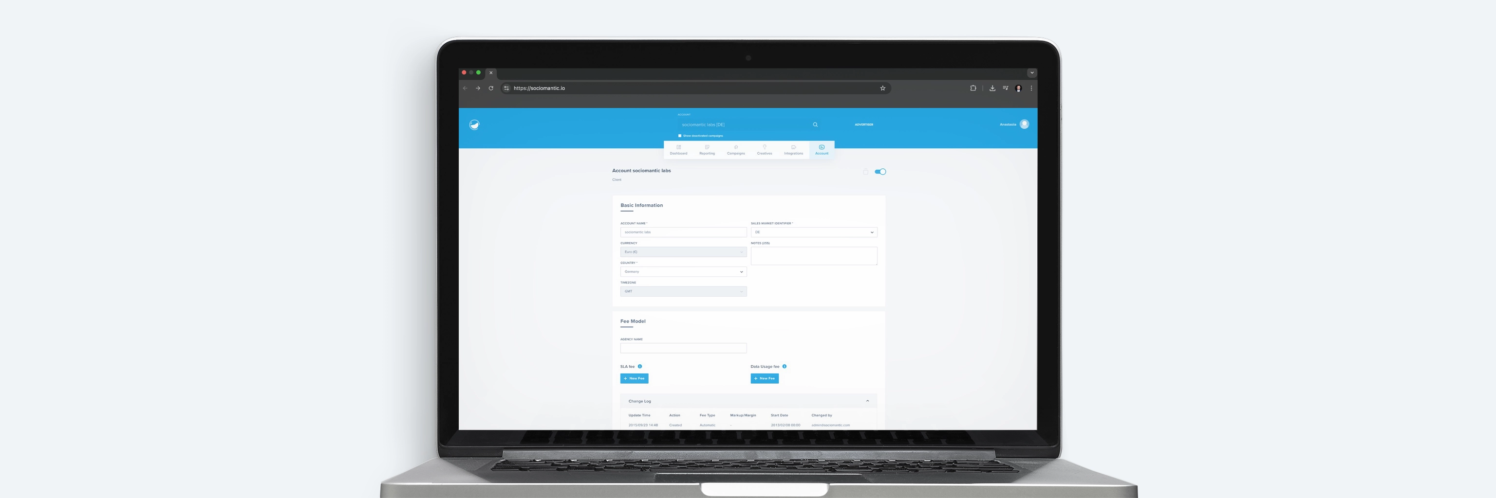
I created a fully fledged design system together with the Web styling team & the UI/UX team. In early 2017, we launched the first version of Nessie ( the React.js design library ) internally, and later in the year made it public together with Lochness. This was a core project for Sociomantic, which defined the interface of its main product, Glassbox, which made the company successful internationally.
Modernized with the UX team the core product "Glass box".
Kept our product user interface consistent across 70 markets.
Help the company in a hyper-growth phase.
Special thanks to Josh Wilson, Conor Cafferkey, Damian Rodriguez, and Wolfgang Niederhoffer.